2014

cover
This was a one-week project at the Burg Giebichenstein. Here each of the students in the class was given one of the in-ten-years-never-borrowed-books in the college library. Mine one was a catalogue for an exhibition just at the time of the fall of the Berlin wall. This group exhibition aimed to present the art scene in Europe during those hectic times by choosing two artists from each of four (former) socialist and four capitalist countries, eight in total, the seven in the name represents the actual number of countries by the time of the exhibition opening (Germany was no longer two different countries).
This book is meant to be a contemporary view of this historical exhibition. That’s why it is designed as a report. It’s also the reason why the content is set transversely, with the purpose of expressing that one cannot see this catalogue on the straight or usual way you see any contemporary one, you have to change your perspective in order to understand its content.
One of the most challenging parts of this work was finding the right combination of two Typographies. They not only should build a good match, but also both types had to have all the glyphs for the five languages represented in the book: Serbian, Czech, Hungarian, German and Italian.
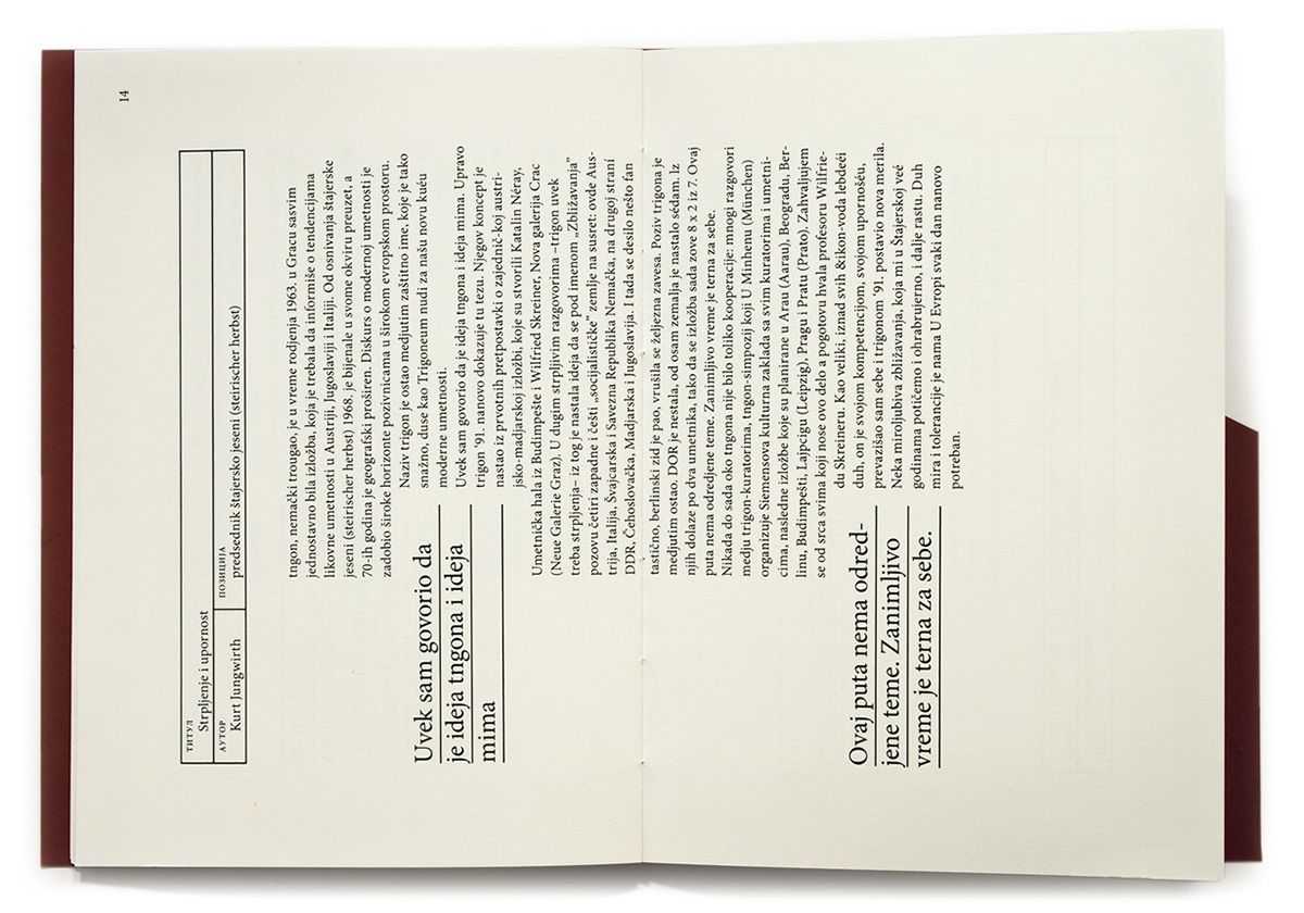
one of the several texts
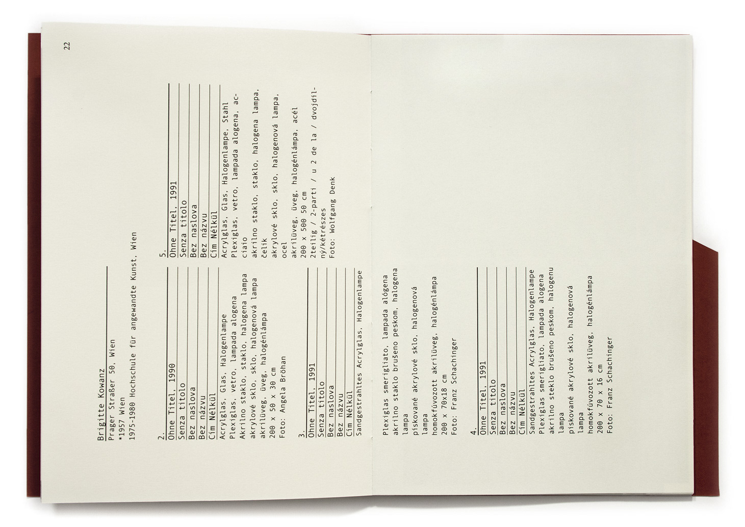
artists' register
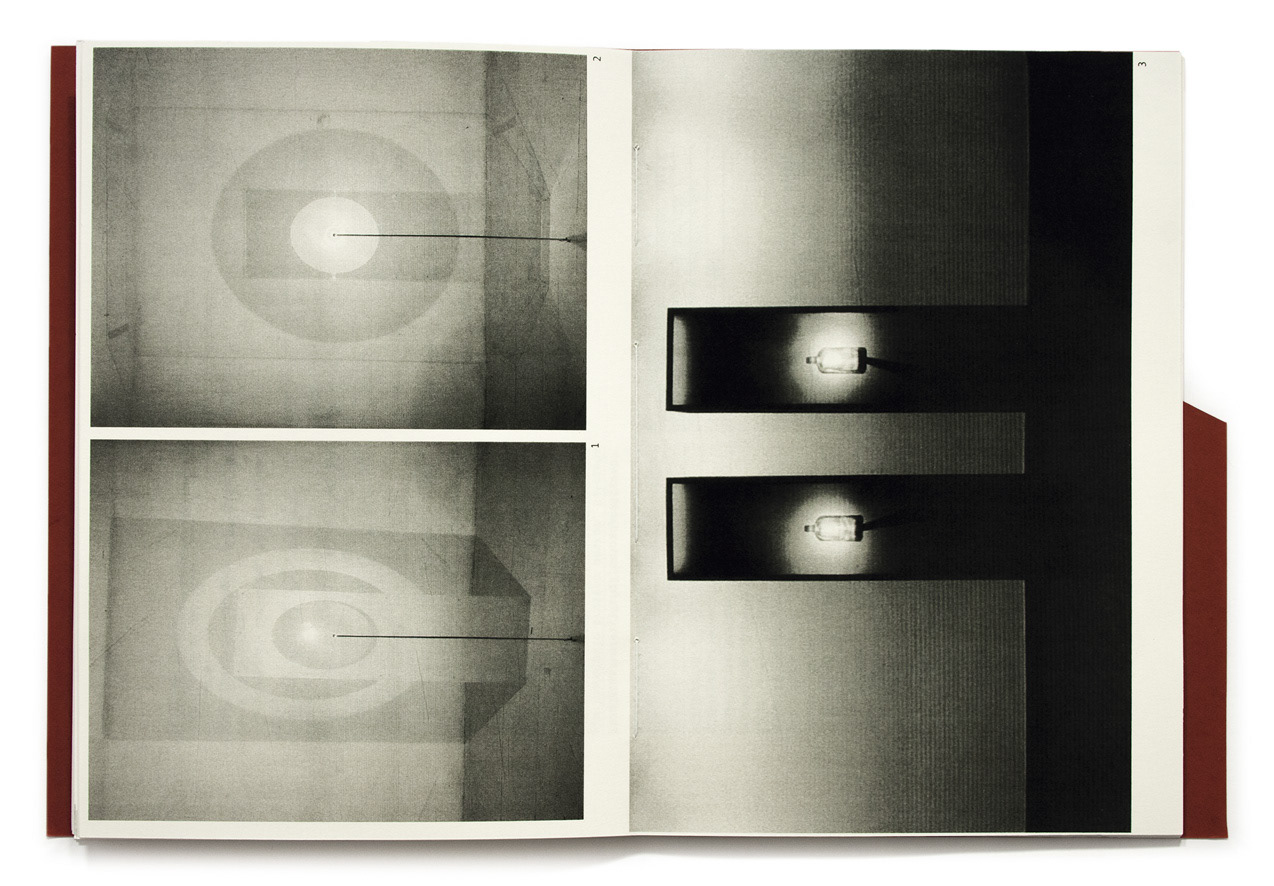

artworks' register